Font by font, one client at a time For over forty years, legendary art director Roger Black has championed the idea that a big brand needs its own typeface. Every font is different, just as every brand is different. Each has its own story. Here are twenty-one of them, in Roger’s own words.
Amira
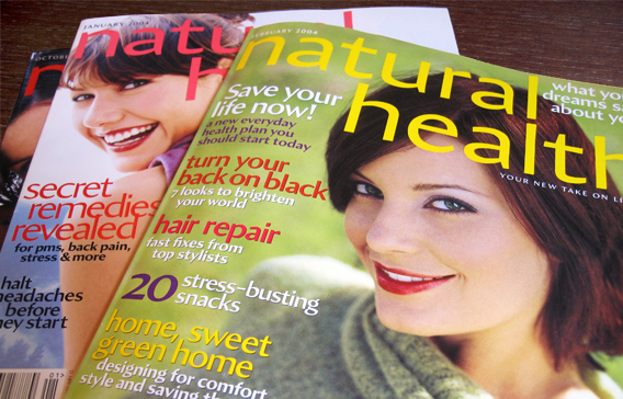
A soulful, handmade sans serif. Editor Barbara Harris wanted a more organic design for Natural Health magazine in 2003. When he heard about it, Cyrus Highsmith said he happened to be working on a slightly new-age sans that might do the trick. Indeed it did, and the magazine debuted the font. Working with a great group of type designers (like the ones at Type Network), you can sometimes get a new design that fits your requirements—but without the cost and time of developing it from scratch.
Under editor Barbara Harris’ direction, Natural Health debuted Cyrus Highsmith’sAmira, a sans serif with distinct calligraphic tendencies.
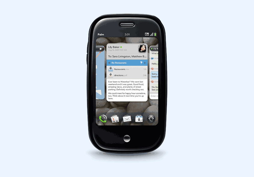
A custom sans for a great smart phone. The Palm Pre phone may be gone, but its typeface endures. Apres, the first geometric sans to be used as a UI font, was designed by David Berlow to read well at the resolution of a 2009-era smart phone. Palm’s brand designer, Peter Skillman, wanted an elegant geometric, but didn’t have the budget to license one of the classics. Font Bureau proved that you can get a great, original, exclusive brand font at a reasonable price. The UI designer, Matias Duarte, who used a stack of cards as the interface metaphor, is now vice president of design at Google.
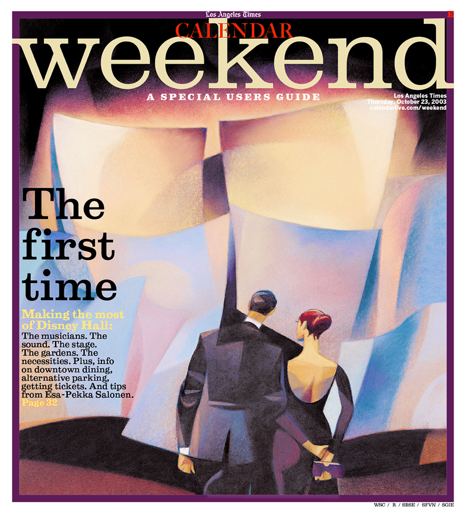
One of the first two typefaces from Font Bureau. David Berlow based Belizio on Nebiolo’s Egizio, designed by Aldo Novarese in 1956. Many early Font Bureau projects were revivals of classic metal typefaces that had not yet been digitized. A principle that accounts for the longevity of our library is that if you like a type design that’s thirty years old (or even more), it’s likely to look good for a few months to come. This “Clarendon” has a little Italian lilt that belies its age.
Font Bureau’sBelizio, drawn by David Berlow, debuted in the Los Angeles Times in 2002 and has been in continuous use ever since, both in print and on the web.
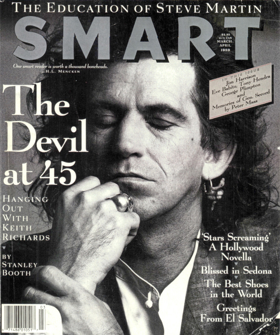
Berlin in the twenties. Back in 1989, Terry McDonell, the now-legendary magazine editor, was starting his own magazine, Smart. When he said he wanted to evoke Smart Set, the stylish, literary monthly edited by H.L. Mencken and George Jean Nathan in the Roaring Twenties, I immediately thought of Lucian Bernhard’s quirky modern, Lucian, a Bauer typeface from 1929. That resulted in another early Font Bureau digitization of a vintage foundry type. At that point, David Berlow was thinking of adding the suffix “Be-” to the names of all his revivals (cf. Belizio), but we talked him out of it.
When he was launching Smart in the mid-1980s, Terry McDonell commissioned Font Bureau to design a distinctive display serif that recalled Lucian Bernhard’s Lucian. David Berlow came up with Belucian.
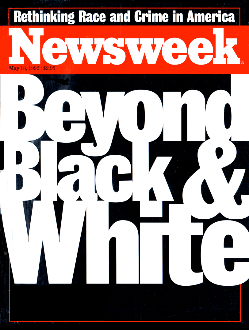
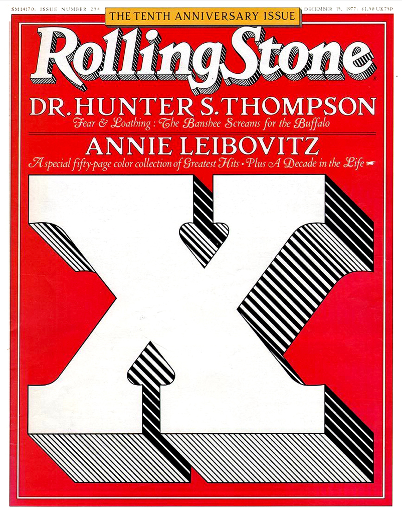
Brits favor curvy grots; Americans like straight Gothics. When I was starting out, Grotesque No. 9, the 1906 Stephenson Blake face, was new to me. So I thought it was new, period. I used it in LA in 1972. A friendly rival, Michael Grossman, put it into the Berkeley Monthly, then made it the display font for National Lampoon. I tried it at Rolling Stone, then based Newsweek’s type around it. In the nineties, we took turns ordering new styles from Font Bureau—Grossman for Entertainment Weekly, and me for Esquire. A big family resulted. David Berlow stacked it up and called it Bureau Grot.
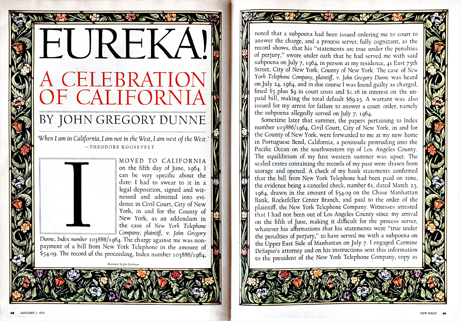
Bringing the metal across the bay. In 1936, Frederic Goudy cut a private type for the University of California Press. Continental later distributed it, and then Lanston Monotype released it as Californian. I got to use it through the typesetter Mackenzie & Harris. After New West magazine morphed into California, I was asked to do a redesign. I thought of Californian, of course, and persuaded Carol Twombly, then at Adobe, to digitize it. Carol brought the sparkling spirit of Goudy into the Bézier curves. Californian became one of the first two fonts at Font Bureau (the other being Belizio).
John Gregory Dunne’s paean to Los Angeles appeared in New West in 1979, set in hot-metal Californian, enhanced with a (colorized) Morrisonian border by Jim Parkinson. Carol Twombly digitized the typeface for the new Font Bureau and New West’s successor, California magazine. David Berlow added an italic and small caps; Jane Patterson designed the bold. In 1999, with Jill Pichotta and Richard Lipton, Berlow added optical sizes: Text and Display.
Contrast and scale. Hired by Susan Lyne to redesign the movie magazine Premiere, I needed something classic with a dash of show biz. W.A. Dwiggins’ Eldorado (1953) came to mind. But the Linotype specimens seemed . . . small. I knew that David Berlow was uniquely qualified to channel Dwiggins and the Mergenthaler culture. In Dwiggins’ hand-lettering style, David grasped clues for how to do a big Eldorado. With an A-team including Tobias Frere-Jones and Jill Pichotta, David digitized the original text and created a delightfully high-contrast display.
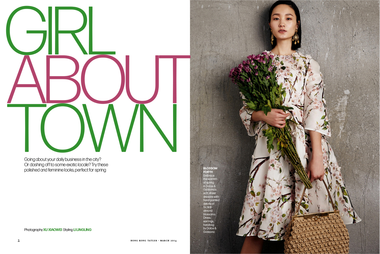
Italy’s answer to Helvetica. Forma is a mid-century grot designed by Aldo Novarese for Nebiolo in 1968 with amazingly tight spacing. The typeface was never adapted for new platforms until David Jonathan Ross’ revival, commissioned by the Tatler magazine group in Asia. A brilliant touch in the original is a slight taper in the stems, which makes the design much warmer. At my insistence, DJR also rounded the corners slightly, an artifact of the plating process in letterpress, and not part of the original drawings. The result is a lively sans that seems very fresh.
Tight but not touching: DJR Forma in Hong Kong Tatler.
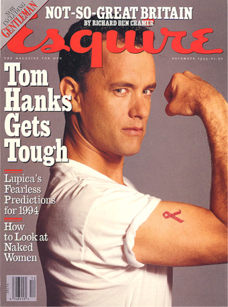
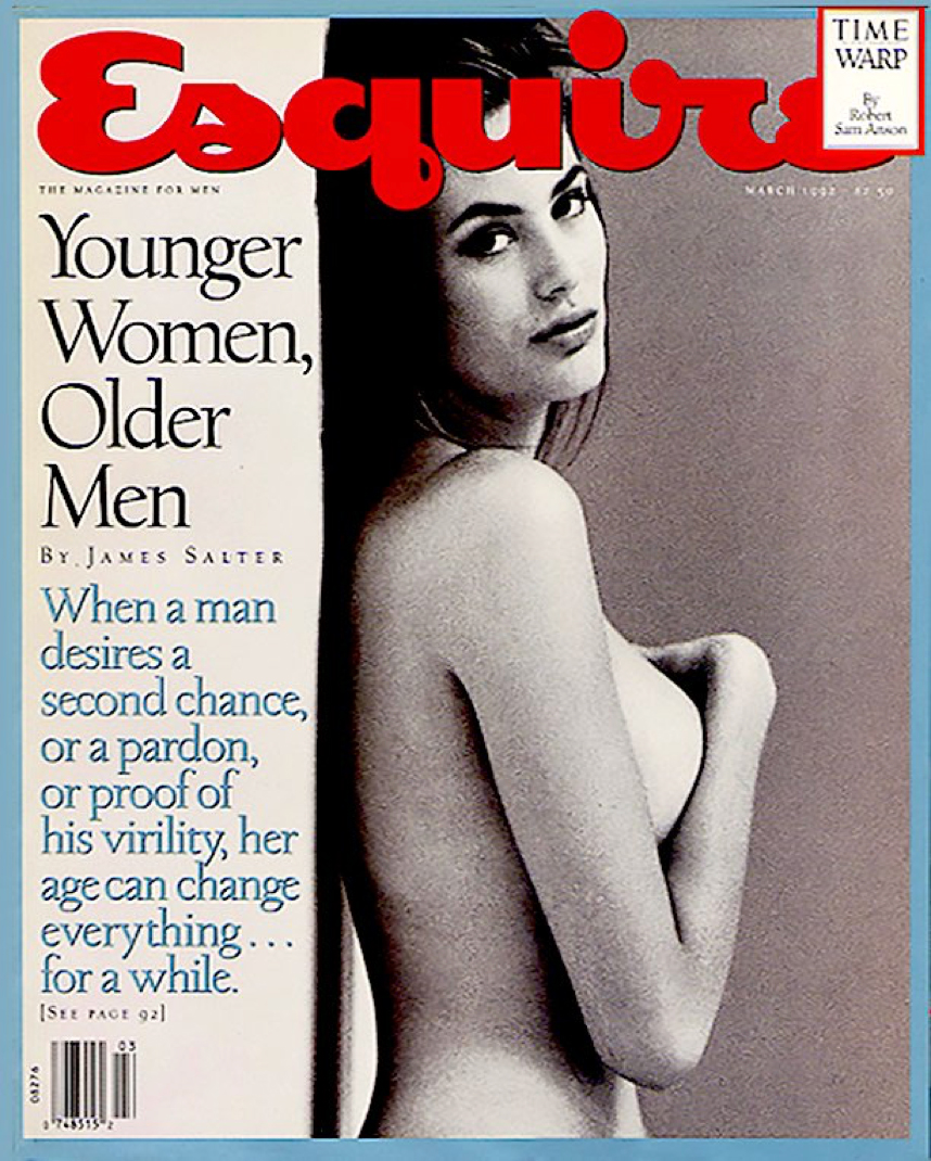
“What’s your favorite typeface?” People ask that a lot. I always cite Egiziano, the robust Nebiolo face, thought to be a copy of Figgins’ Two-Line Antique (1815). The Italians may have copied an American copy of this, since it was the Americans who first called a slab serif an Egyptian (un Egiziano). I’d been wanting a digital version since we started Font Bureau, and David Berlow thought it would be perfect for TrueType GX Variations, the first variable font technology. Before I knew it, there were dozens of weights and widths, and the condensed instances were perfect for Esquire and its spinoff, Sportsman.
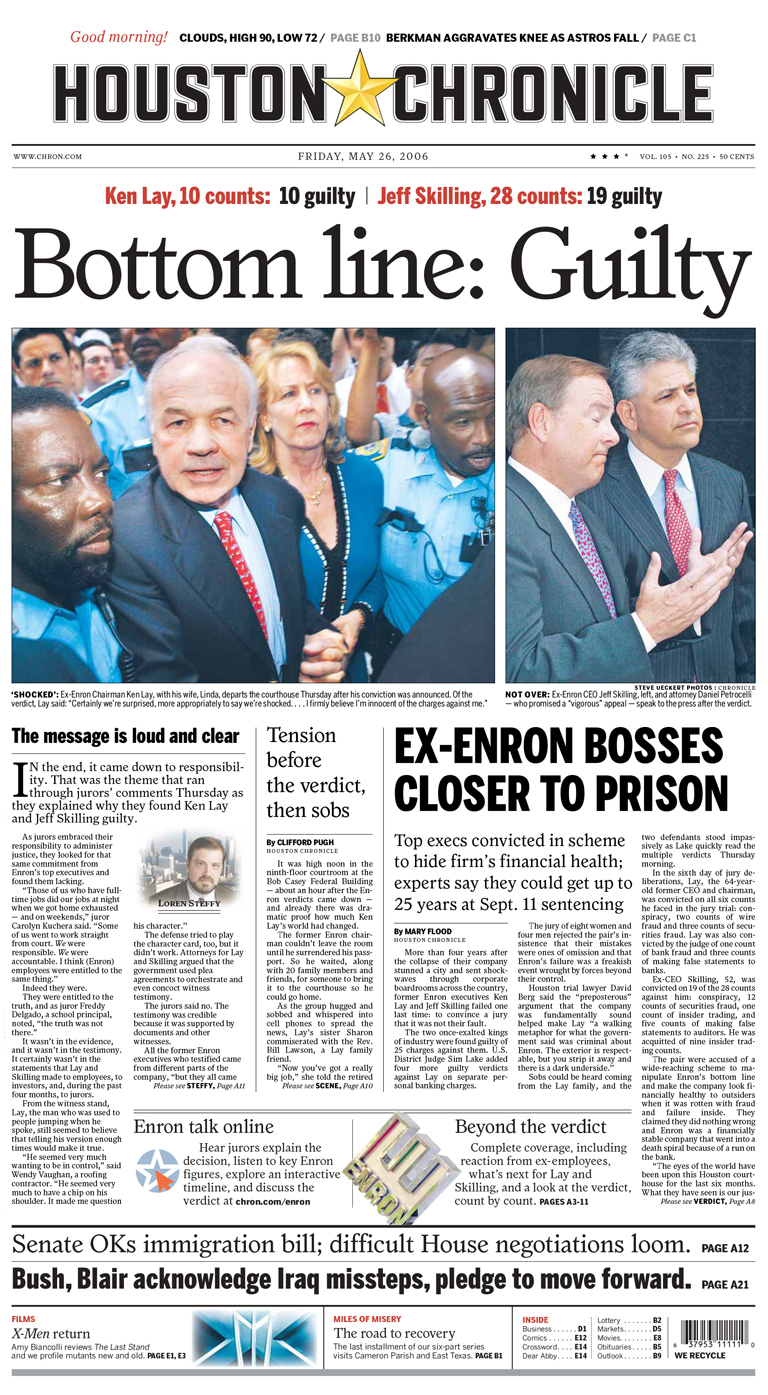
A Venetian oldstyle for newspaper text? Why not? I made another run at the arts-and-crafts Jenson style for the Houston Chronicle (2003). Christian Schwartz, then still at Font Bureau, drew the assignment, after closely studying William Morris’ Golden Type, ATF Jenson, and British Monotype’s Italian Old Style. We called it Houston. It was strong and stylish—with a faint whiff of the great days of the Hearst press. For body text, I was thinking of my old standby, Ionic No. 5. Just for fun, though, Christian threw Houston on a body-type on-press test. And it worked! He tweaked the contrast and spacing, and we launched with optical sizes for text, decks, and headlines.
Christian Schwartz’ Houston in the Houston Chronicle for heads, decks, and text.
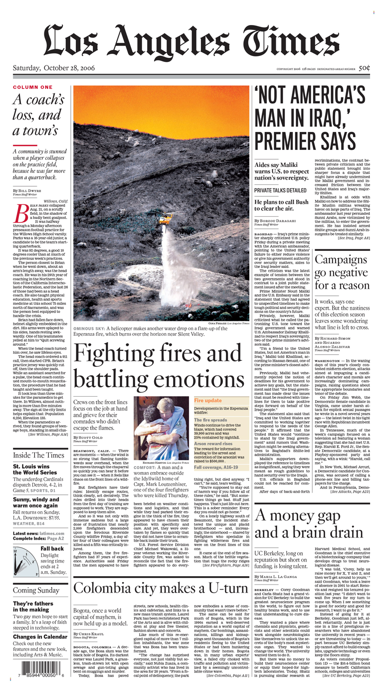
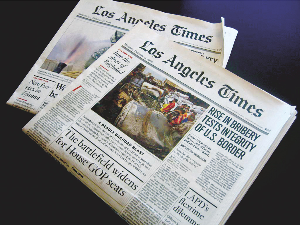
Back to the future. For a 2000 redesign of the Los Angeles Times (see Titling Gothic), I wanted a headline face that was both classier and more classical than the somewhat generic Times-Romanesque font they were using. I didn’t go back as far as Mike Parker had with Poynter, but looked at Times’ daddy, Caslon, and then its granddad, the seventeenth-century type of Nicholas Kis, and loved them. David Berlow rose to the challenge, and created a full-throated Dutch display. In my opinion, this is the best Kis revival; the LAT has used it ever since. David did all of the sizes—banner, headline, and deck. For text, we opted to use Ionic, but there’s a strong design in our archives waiting for a customer who wants the clout and credibility of Kis.
Since the early aughts, the Los Angeles Times has used David Berlow’sKis FB for heads and decks.
Turn up the contrast. One size of a brand font is often not enough. The Chicago Tribune had been using Century as its main headline face, but for a redesign of the Sunday magazine in the early nineties, they wanted something elegant—a display Century with more contrast. Meanwhile, David Berlow, deep in the maelstrom of GX Variations, was thinking about a design upheaval two hundred years ago, when the new contrasty modern typefaces inspired slab serifs, and then no serifs at all. Out of this historical-technological vision, the Trib got its elegant Century. The custom font was called Millennium. Its successor is Moderno.
Nicholas Jenson on acid. Hired at Rolling Stone in 1975, I was charged with coming up with a custom typeface. The first step was identifying the style, and I thought the William Morris-inspired arts-and-craft Jensons of the late nineteenth century—my favorite being the Nebiolo Jenson—might make a good starting point. I began by trying out existing phototype versions in the magazine, at first with promotions. Jim Parkinson, who had trained with Hermann Zapf at Hallmark, came highly recommended, and we began to work together on a display family called Rolling Stone. Styles of the new face, later dubbed “Parkinson,” began to appear in the magazine, and were completed in 1977. A dozen years later, the magazine switched to desktop publishing, and Jim Parkinson digitized the family, with the help of Font Bureau. Forty years after we started, it’s still in the magazine.
Sometimes you need to go back to move forward. In the eighties, the Poynter Institute had a design program led by Mario García. Together we studied newspaper type, and found that the letterpress text faces were not good with offset—particularly the ever-popular Times Roman. And it was clear that newspaper design was trending toward more refined typography. The brilliant Mike Parker thought about all this and said, “Well, if Times is no longer working, let’s go back a century.” Pressed, he explained: “Van den Keere.” What he was thinking was that if the thins of Times, based on the high-contrast seventeenth-century Dutch designs of Nicholas Kis, were breaking up, then we should adopt an earlier Dutch model, namely the sixteenth-century oldstyles of Hendrik van den Keere.
Poynter, designed by David Berlow and Tobias Frere-Jones.
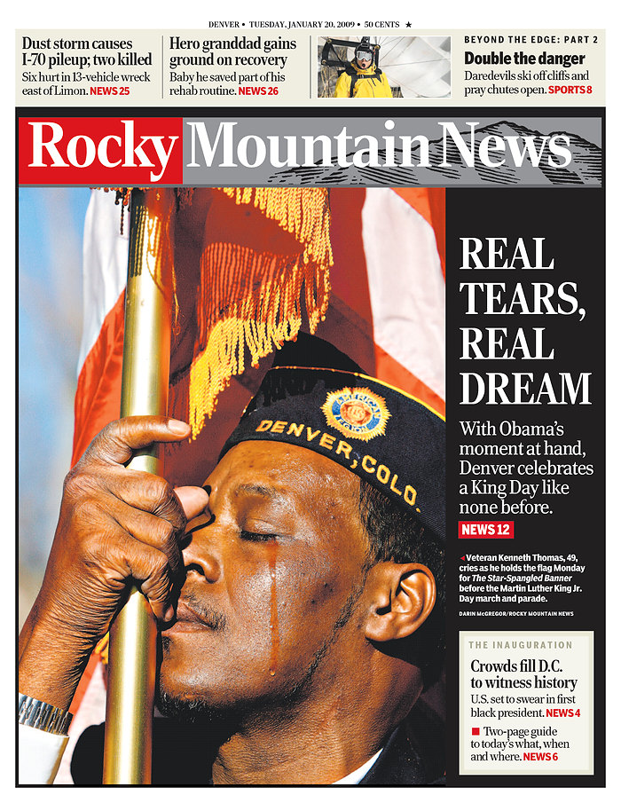
Stress. In 2002, at the Rocky Mountain News in Denver, John Temple and I created a daily magazine. The budget couldn’t withstand a custom type family, so I went for the next best thing—I called around to various designers and asked, “What do you have in the bottom drawer in the way of a newspaper type?” Matthew Carter sent me a headline he was calling Madrileña, a punchy Latin with chiseled serifs, originally planned for a redesign of El Pais. Because of its vertical stress, it could be gracefully condensed—perfect for headlines. The Spaniards couldn’t bear to part with Times Roman, so we got Rocky!
Matthew Carter’sRocky for the Rocky Mountain News.
Good with grots. A heavy grot was Newsweek’s headline type for fifteen years, but we had trouble settling on a companion serif for text—and display, too. I started with ITC Cheltenham for the 1985 redesign, but that seemed too “Timesy” to me. Some ten years later, working with Patricia Bradbury and Amid Capeci, I suggested we go Scotch (as in the nineteenth-century transitionals from Scotland). David Berlow whipped up a convincing headline type—and a text. By coincidence, Time had engaged Matthew Carter to make a new text face based on Dwiggins’ Caledonia. I have to say, it’s very hard to compete with Matthew.
Designer labels. For labels at the Los Angeles Times (a design I worked on from 1999 to 2005, surviving four changes of editor-in-chief before the fifth fired me), I wanted a simple American Gothic. I pointed to a weight of Titling Gothic, a caps-only Morris Fuller Benton design in the 1923 ATF specimen book. David Berlow wasn’t sure I had the weight right, so he built a width axis for the design, and after the weekend sent me sixteen different instances. Man, oh man. Now there are forty-eight weights and widths, with a lowercase inspired by Railroad Gothic. Mind you, in the age of variable fonts, you can get any weight or width you want.
David Berlow’sTitling Gothic in use for labels in the Los Angeles Times.
It takes a village to make a revival. A longtime Goudy fan, I love his quirky styles—all devilishly difficult to digitize (see Californian). For example, no one has done a good outline version of Kennerly or his Italian Old Style. Working with Terry McDonell again, this time at Esquire, I thought Goudy’s Village No. 2 (1932) was perfect for the individualistic sense of style that matched what we wanted for the magazine. David Berlow delivered.
David Berlow’s revival of Goudy’s Village No. 2 was a first step in the redesign of Esquire.
Custom design allows you to tailor a typeface precisely to a brand—across all of its platforms and applications. You can get your own custom face. It’s more approachable than you think. But why would you want to do that, with so many great typefaces already in the world?
Well, sometimes all you want to do is translate a great analog design to digital (see Californian, Village, Forma). Sometimes you want to start from scratch (see Apres). Sometimes you sift through history for answers to new problems, and wind up with a thoroughly contemporary interpretation (see Parkinson, Poynter). Sometimes you have a model, and then build out optical sizes—or weights, or widths, or languages, or character sets—until it really becomes something new (see Giza).
To tell great stories, a single brand font is the foundation of typography. Combining a serif style with a sans-serif brand font can enhance your message. Many of the examples here (the Los Angeles Times, for example) show two custom families used together. The key is to use a limited set of type families—and styles—to distill your message and give it a unique character.
“For the past thirty years, brand and digital designers have been designing with a single optical size and a limited number of styles. Many designers can say when a custom font is needed. But some designers, like Roger Black, know how to use optical sizes and multiple weights and widths to carry the brand type in all kinds of situations.”
—Sam Berlow, Type Network
With the advent of OpenType variable fonts, of which Type Network has been an early pioneer, the concept of brand type becomes even more effective. Size, width, weight, and other style variables can be combined into single font files. This saves network resources, boosts download speed, and simplifies distribution. What’s more, variable fonts enable designers to manage the instances of type styles, giving clients a new degree of control over the application of a brand.
All of our custom typefaces evolve in open collaboration with the client and other relevant stakeholders, following an extremely close reading of the brief. Type Network thoroughly tests all typefaces across all platforms and applications, and delivers finished font families in the appropriate file formats. Reach out to talk with us about your custom project today. We’re listening.
About Roger Black
Photo courtesy of Dan Rhatigan.
Roger Black started out as a publication designer in the 1970s, working as the chief art director at Rolling Stone, New York, the New York Times, and Newsweek. He opened his own design firm in 1987, and two years later founded Font Bureau. Black was an early adopter of desktop publishing, and then of the web, designing sites for MSNBC, the Discovery Channel, and drugstore.com in the mid-nineties. He continues with print, and is the editor and designer of a quarterly magazine, TYPE. Last but not least, he’s on the board at Type Network, which licenses all of the fonts used on this site.